RenderMan Magic Shop Art Challenge
And now for something completely different.
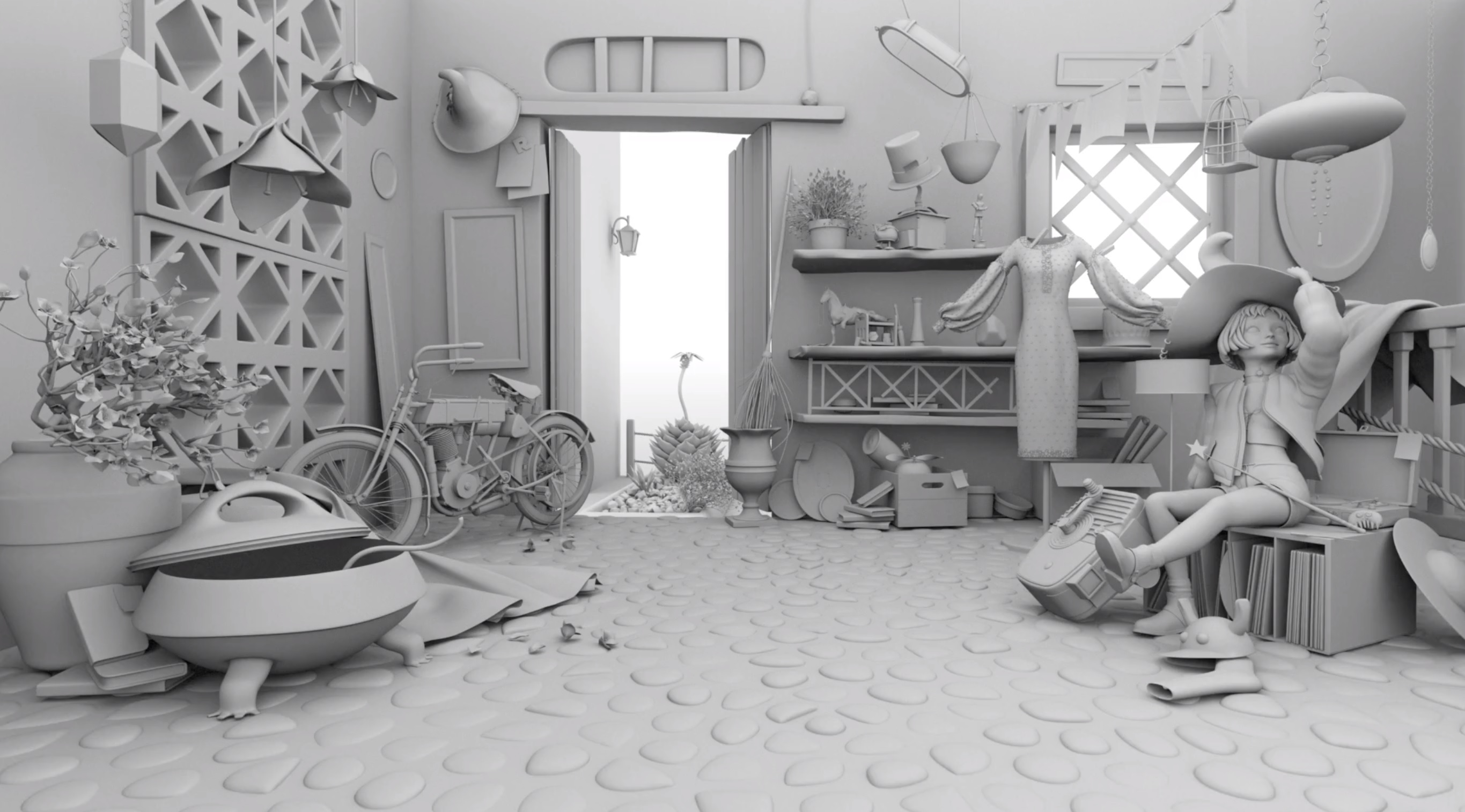
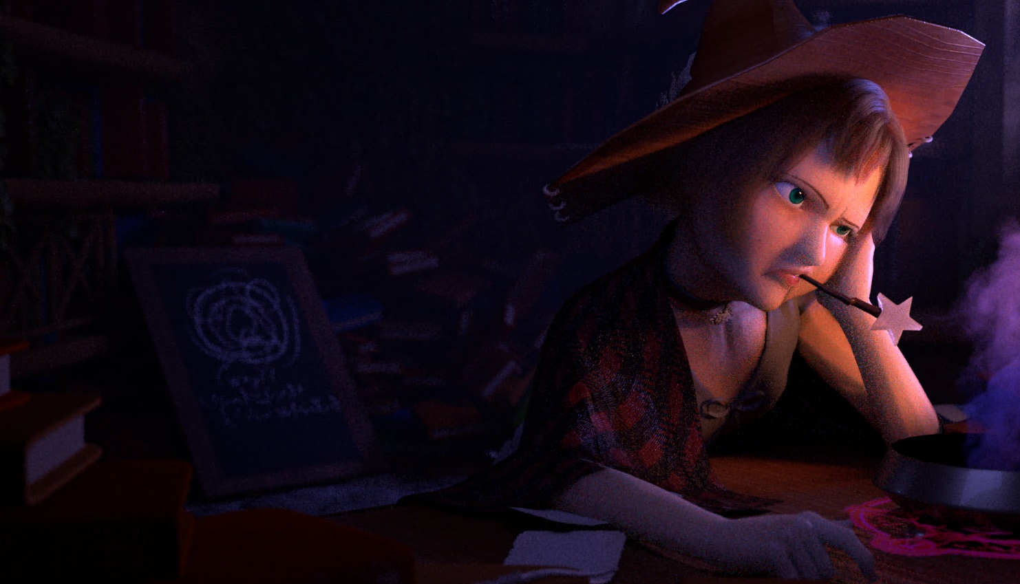
A combination of this post from Yining Karl Li and a general itch to do something more artsy made me attempt something a little crazy, the RenderMan Art Challenge! The idea of challenge is to take a untextured scene and turn it into a nice final render in 90 days. You’re allowed to add your own VFX and modify the scene but the story-telling must revolve around the provided assets. This challenge was extra interesting because they also provided a fully rigged character model to work with, here’s what the provided scene looked like for this challenge:
And here’s what my final entry, titled “Midnight Meltdown” looked like (click for the full 4k image):
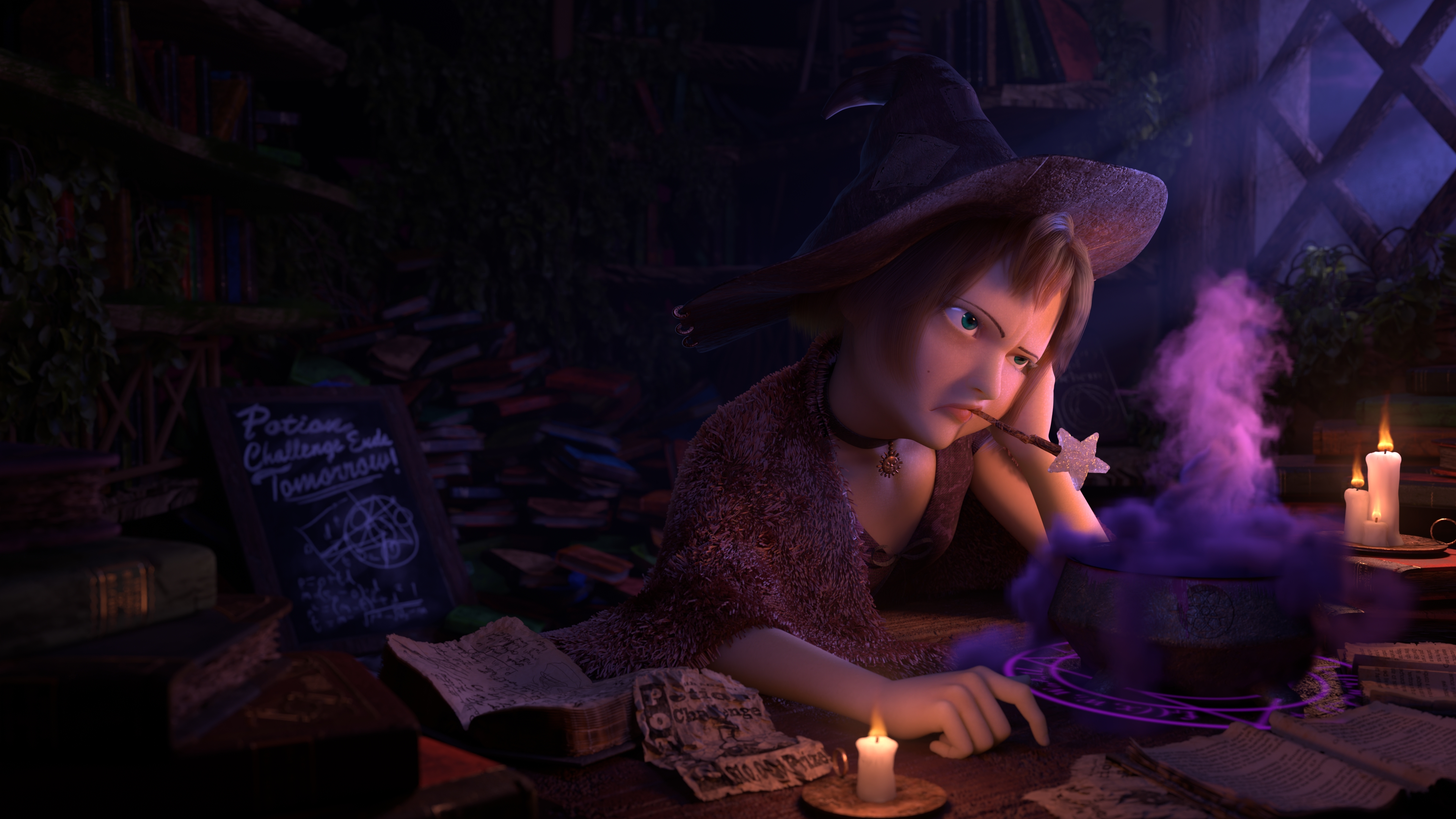
I still find it a little hard to believe, but my entry ended up getting first place! I highly recommend checking out the other entries, I actually liked a lot of the other entries more than my own, honestly when I submitted my entry, I had zero expectation of even getting placed!
This post went on longer than I expected, but hopefully it’ll give you a sense of what it took to get to the final render. If you don’t like words, I won’t be offended if you want to scroll through and see some cool pictures, though my hope is it inspires some folks to give the challenge a try themself (especially those from an engineering background). The challenge is free for anyone to enter and you’ll get feedback from some of the Pixar folks as well as other people participating which was an incredible experience that I can’t reccomend enough.
Concept
For the concept, I wanted to aim for something I could strongly relate to. Professionally, I spend an almost embarassing amount of time banging my head against my keyboard trying to understand why pixels look like one color and not another. Sometimes, issues I’m trying to debug take spend days, even weeks! The worst of those bugs can drive you insane with whiteboards full of crazy theories that feels remincent of some kind of detective movie. That fun little mix of insanity and frustration is what I wanted to revolve my concept around.
For the setting I had this vision of the Magic Library Trope meets a messy college dorm room. Meaning books everywhere as if she’d be researching in a frenzy with little regard for cleanliness. But I also wanted an atmosphere of coziness and solitude, like sitting alone by a fire on a cold winter night. That led me to experiment with a combination of cool and warm lights. Here’s some of my original concept shots with just the scene assets re-organized and some test lights:
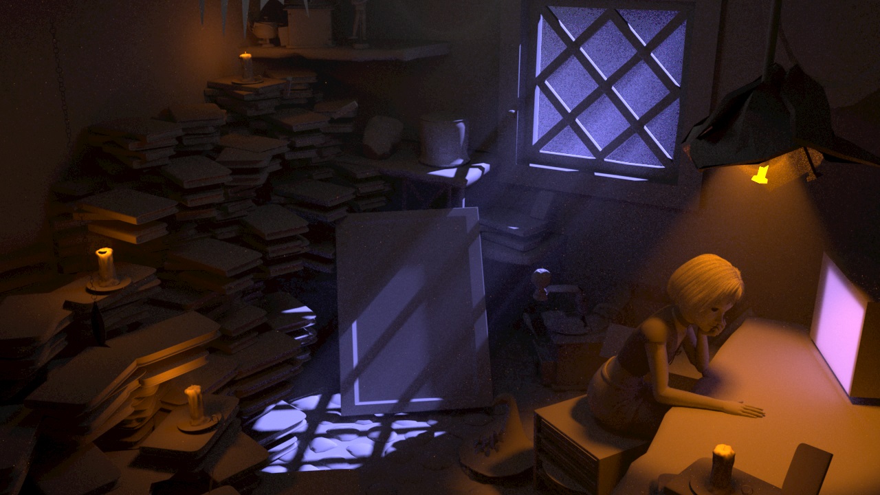
Concept Shot 1. Originally I had this idea of the character working on a magical computer, the pink light on the right is supposed to be a monitor.
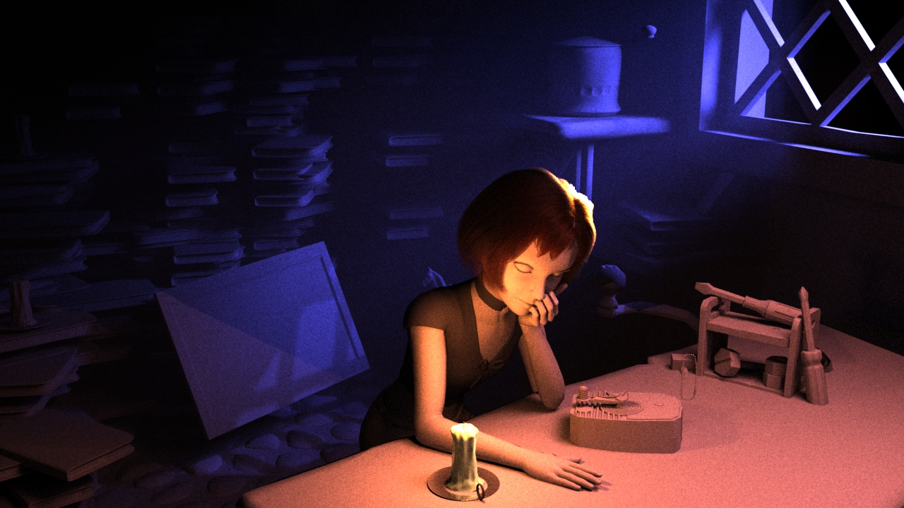 Concept Shot 2. Another idea was that she’d be trying to be decrypt some kind of magical artifact.
Character Posing
For the challenge, they provided a Mathilda model created by Xiong Lin and rigged by Leon Sooi. The rig could be controlled via Anim School Picker which was incredibly intuitive and generally just fun to play with.
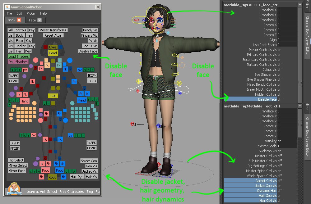
Anim School Picker UI for the Mathilda Rig
For the posing, I wanted something Pixar/Disney-esque. I gathered a bunch of my “Art of …” books (I’ve gathered a small collection from both games and CG movies) and started pouring through a bunch of the gesture drawings. I could have used real-life photos as a reference, but I was worried about the pose looking too stiff if I followed those too closely. Animators are masters at capturing the essense and emotion of a pose and you can see that best in gesture drawings. My biggest inspiration was the work of Jin Kim, one of the many talented animators and character designers at Disney. If you haven’t seen his work, stop what you’re doing right now and google him immediately. I’d put something here but I’m not sure about what permissions are required, so you’ll have to find it yourself, I’ll wait.
My favorites are some of his character drawings in the “The Art of Big Hero 6” and “The Art of Moana”. It was also a good excuse to rewatch Big Hero 6, there’s a part where Tadashi is very tired looking (if you’ve seen it, you’ll probably know what I’m talking about) that was also a helpful resource.
A couple of the nuances that I think really helped:
- Getting the gaze at just the right angle so that it’s almost a bit of an eye roll (Thanks to Leif Pederson for much needed guidance)
- Combining the low camera ange and a tilt in the head to accentuate irritation
- Pushing and sort of inflating the cheek that’s resting on her hand too make it look compressed. If you try the pose yourself, you can feel how your cheek pushes into your eye.
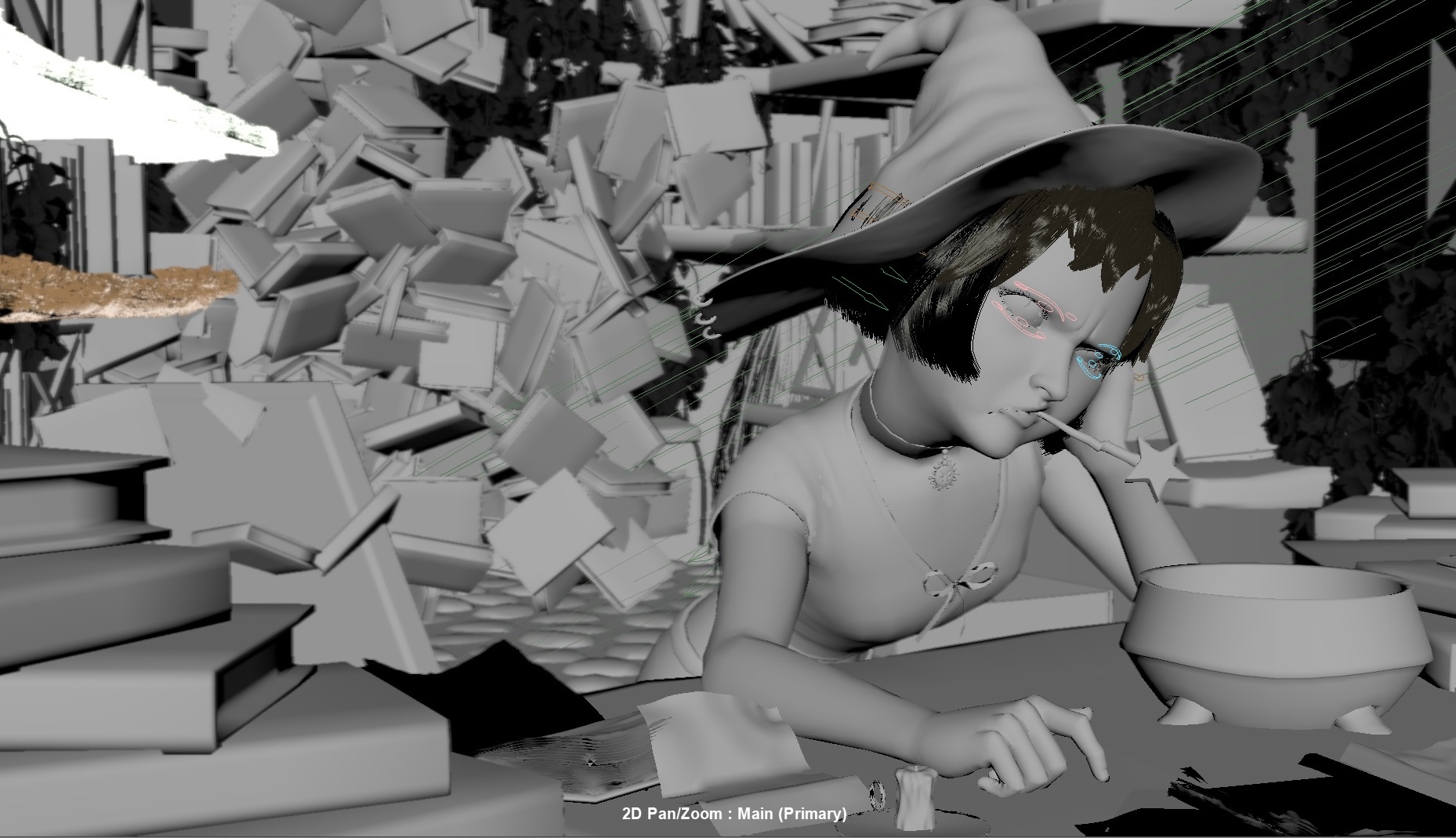
Viewport with the untextured model that better shows some of the rigging
Character Skin and Eyes
Some starting texture assets were already provided for the skin. I largely stuck with textures provided though I had to come up with the subsurface material parameters myself. One of the trick I took from skin in the RenderMan Material Pack was to convert some worley noise into a bump map to help add natural variation to the skin’s texture. I also painted in some darkness under they eyes to suggest some sleep deprivation.
The eyeball took quite a bit of tweaking to get them where I wanted. The provided eyeball geometry consists of a sphere that represents the cornea/schlera and a separate interior disc geometry for the iris. It makes it a smidge more complicated than just slapping a texture on a sphere, but it also gives much more depth to the iris which I liked. There is a PHENOMENAL tutorial on making a realistic human face in RenderMan by Leif Pederson that I heavily referenced for the eyes. The short of is to use subsurface scattering for the sclera (the white part) of the eye and then a glass material for the cornea to allow light to hit the iris geometry. The specular needed to be cranked up so you get those bright highlights you expect on character eyes. I also had to tack rod filters (essentially capsules you can place that can either block or intensify light within the capsule) to block specular light selectively around the eye because the eye was so reflective that it was picking up a bunch of distracting hot spots from supplemental lights. I also added a white beam light specifically to add the white highlight on the left eye. And finally I tinted the schlera reddish-yellow to help convey some fatigue.

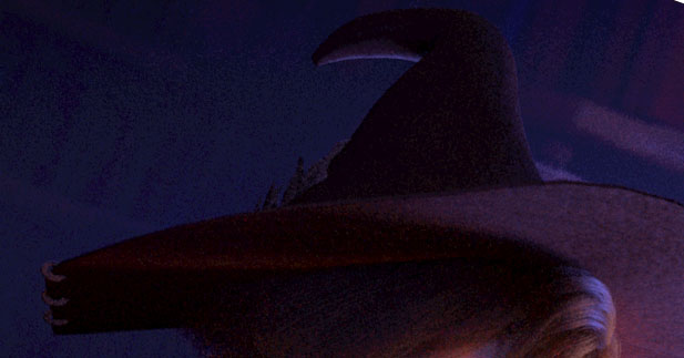
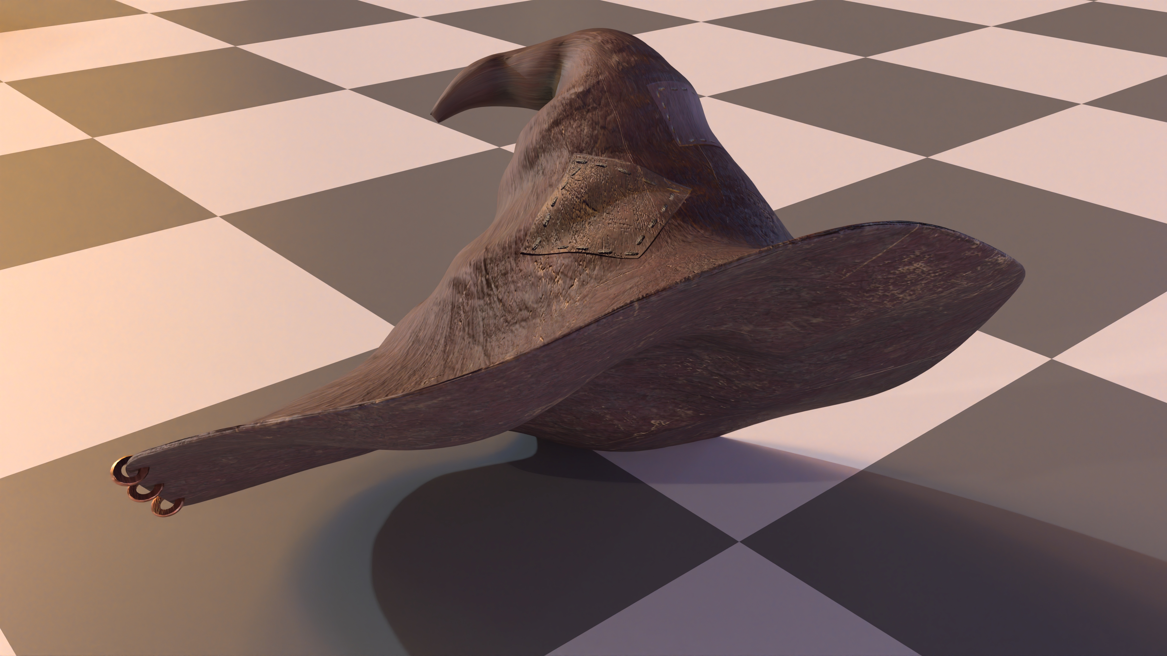
Witch Hat
For the witch hat I wanted to go for something that looked like a bit of a hand-me-down. Going back to the idea of a messy college dorm vibe, I wanted her clothes to seem worn in. The hat provided in the RenderMan challenge was a great start but the geometry was too smooth. Normally relying purely on texturing to show wear would have been sufficient, but because the hat was such a prominent silhouette in my scene, I wanted to make sure the underlying geometry looked worn also.
Zoomed in shot of the hat before adding in any wrinkles
I went through several failed attempts to get some wrinkles in. The first trial was just using the nCloth sim built into Maya. The problem was the hat would always collapse into itself and no reasonable settings seemed to help without making the hat overly rigid. My second thought was to give Blender’s new cloth brushes a try. They still run a cloth sim but you can control where they get applied so there’s still a bit of art direction allowed. I had better luck with this, but I started to realize that I was a little too attached to an idea of how the hat should look in my head, and getting a cloth sim to match up to my vision just wasn’t going to work. So I threw the idea of running a cloth sim out the window, I figured I’d try to sculpt the details in myself. I grabbed a trial of ZBrush and hammered away at the thing. It took a bit to get use to ZBrush but once I got started, it was REALLY fun. I’d only modelled in Maya/Blender before so it really flipped my perspective on how organic 3D modelling could feel. My end result wasn’t terribly great, but it was still far better than what I was getting from the cloth sim and I thought looked compelling enough.
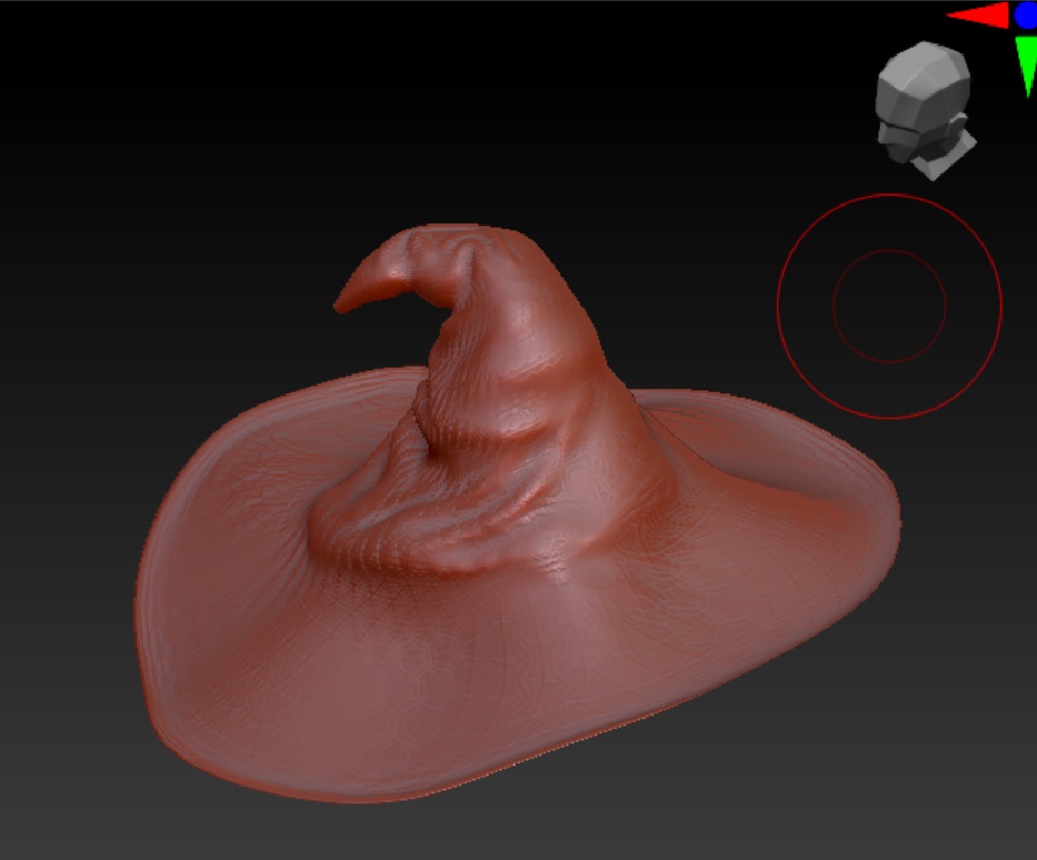 Viewport of the hat in ZBrush
Afterwards I tooked the sculpted hat and threw it into Substance Painter for some texturing. I had a pretty standard looking leather material with some scratches, but I also added some patches. Substance Painter has this cool built-in stitch alpha that made it really straight-forward to add some nice stitching around the edges of the patch. Substance Painter also does a pretty nice job of changing height maps into a convincing normal map, so I didn’t end up needing to do any kind of displacement for the patches. Here’s the end result:
Blanket
I wanted a cozy feel along with the candle lighting and I thought having a nice warm looking blanket around the character would help add to the atmosphere. I subdivided a plane and used Maya’s nCloth sim to get it to drape over the character. It made an okay starting point but I still had to do a whole bunch of manual vertex pulling to get it to look like it was convincingly wrapped around the character.
 Wireframe of the blanket geometry
Okay, now to texture the thing. I wanted something warm looking so I though flannel would be a decent idea. So I followed this great Substance Painter tutorial on making a flannel blanket. And the end result was, well, flannel. Something about it really didn’t look right to me:
 Render of the scene when I was approximately half way through the challenge with the flannel blanket
Nicoler, who was also participating in the challenge, had a fantastic suggestion of both extruding the blanket to make it look less flat and then using XGen grooming to give it some texture. I hadn’t used XGen before but I was pleasantly surprised with how easy it was to work with. Essentially you can add XGen grooming onto a mesh and it will just spam a whole bunch of splines everywhere on the mesh. There’s then a bunch of brush tools that let you “groom” the splines, the most useful one being the noise brush that lets you just randomize the spline direction/length/etc to make it more naturally chaotic. And best of all, it works great with RenderMan’s Marschner Hair material. I liked it so much that I flipped my idea into making it more of a big fluffy fur blanket! I really agonized over the grooming and literally continued to groom the blanket in different ways up until the very last day of the challenge. But overall, I liked how it ended up!
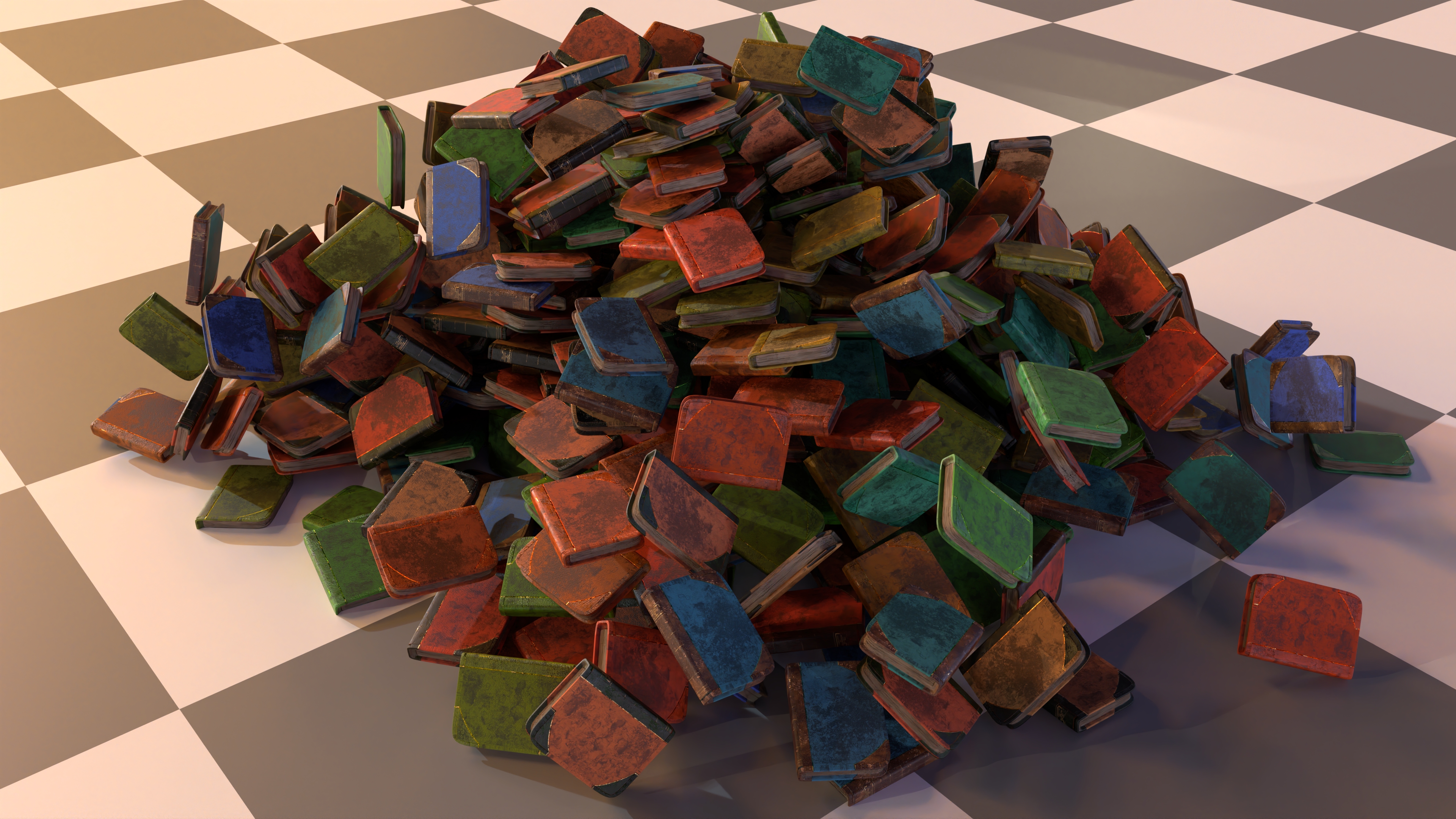
Books
I knew early on I wanted to have huge piles of books everywhere, as-in over a thousand. This had two challenges:
- How do you texture over a thousand books?
- How do place thousands of books?
For the first question, “how do you texture over a thousand books”? I was very excited to think about a procedural book material. I’d been doing load of pure art work up to this point and I was eager to see if I could sneak some programming into the challenge. I had a huge ambitious vision for what this material would be with procedural tears and dirt and varying text. Needless to say time didn’t allow for this. But I was able to fulfill a small slice of what I set out to do.
The final material ended up being relatively small (especially if you compare it to the amazing things you see in Nodevember). Up close, the books weren’t too compelling, but since they were all in the dark and covered up by depth of field, it was good enough for my purposes. I added some hero books that had custom nicer materials in the foreground to help cover for my not-so-amazing procedural material. The procedural material supported:
- A layered material that was a combination of fabric, leather, metallic trim, and paper pages. The base material largely came from following along this fantastic tutorial on making a book in Substance Painter
- The leather and color both had their own random color ramp variation. Essentially it randomly tints the diffuse albedo.
- A couple of different variations of how the leather and fabric would layer together
- Extra displacement on the book pages to give the illusions that each page was it’s own plane
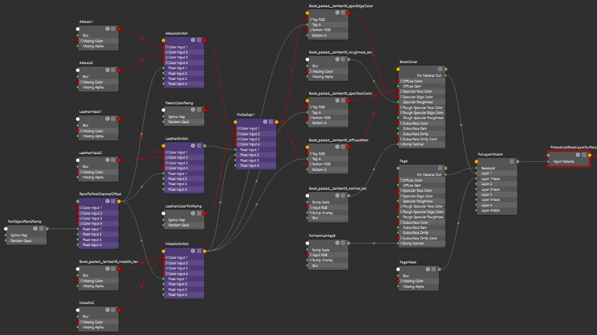
The PrxLayeredSurface Material graph for the book material
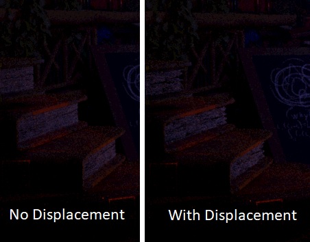
Displacement is used on the pages to make silhouette look more like ruffled pages
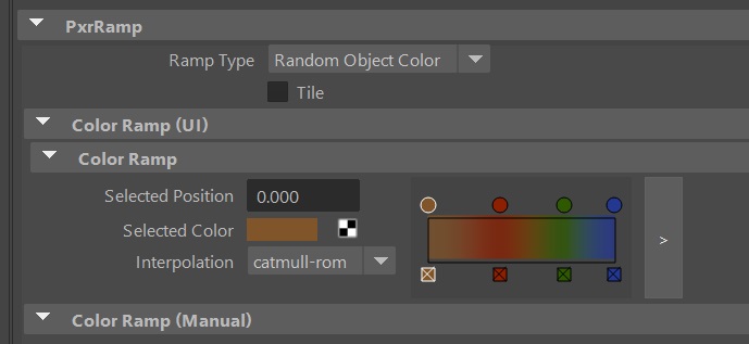
The main thing I leveraged was this cool node called PxrRamp. It lets you a completely tunable color ramp and then a random color gets pulled from that per object. It was quite cool because I could just duplicate books around and they would automatically look different without any work thanks to the PxrRamp!
Okay, so thousands of books textured. Great. Now where do we put all those books? I turned to the built-in bullet sim included in Maya for doing a simple rigid body simulation. Since the books were basically just blocks, it was more than sufficient and really fast! Essentially I just pasted books vertically until I had essentially created a Jenga tower of 1000 books and then let the simulation do it’s thing. Here’s how that looks:
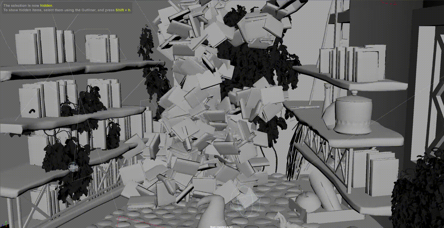
Some of the books still ended up in an awkward position so I just went through and manually hid any books I didn’t like after the sim. All the books on the shelves were manually placed by me and a whole lot of copy-paste. I also did a whole bunch of manual rotation just to give the sense that some of the books were falling over and leaning on each other.
Here’s how it looks putting that all together (excuse some floating books, I missed a few):
Opened Books
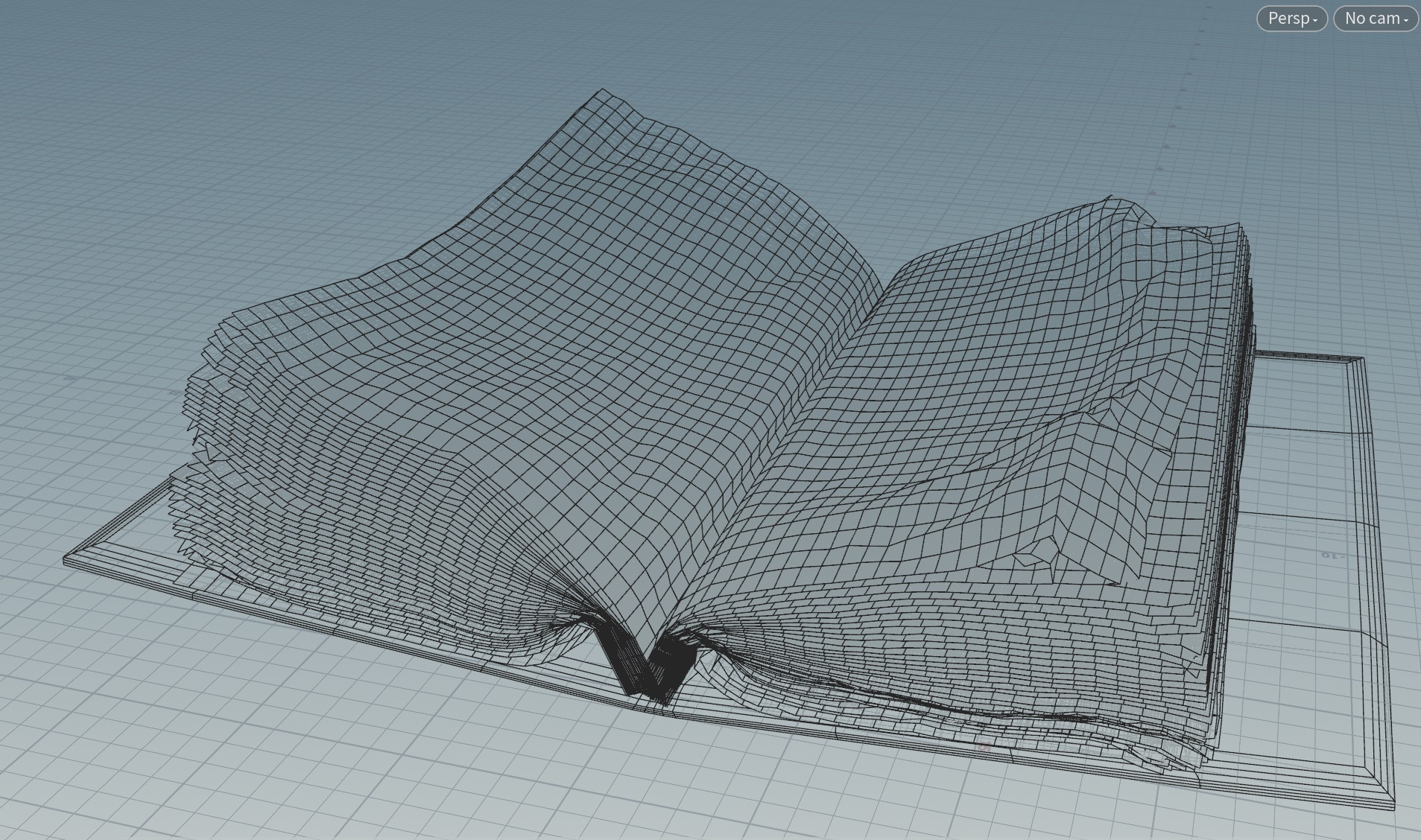
I also wanted to have the character surrounded by a bunch of opened books. The look I was aiming for was a messy desk filled with textbooks and journals as if you’re deep into some sort of research project. The main challenge here was getting some nice looking pages. I could have done some modelling (and in hindsight, maybe I should have), but my modelling skills are real poor so I turned to sims instead. I cloned a whole bunch of planes and them imported them into Houdini to sim using the vellum solver. It was quite challenging to get the pages to fall naturally, I had to do some real silly things to get the pages to fall naturally, including adding some fan forces to literally blow the pages away from the spine of the book. Here’s how that silliness looks in action:
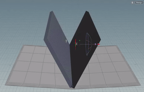
I lost the actual sim I used, so this is just a recreation. I also didn’t crank up the collision iterations so it’s a little flatter than a more robust sim, but hopefully you get the idea.
The final actual mesh looked like this:
The final sim look okay, I had to delete some of the top pages because they crumpled in some unnatural ways. From there I took the alpha from a page texture from Textures.com to make the planes look less perfect. For most of the books, I just copy pasted a bunch of text from one of my other blog posts and slammed it on top of the texture. For the book next to the character’s arm however, I wanted it to instead look like a journal. I’ve always loved Da Vinci’s journals and his mix of art and engineering have always been a huge inspiration for me, so I wanted something reminicent of his journal. I drew up a journal page in Autodesk Sketchbook, it’s hastily thrown together, but I think that’s part of the appeal of a journal. Something you also expect from pages is that they’re thin and some light should pass through the page. Normally you would turn to subsurface scattering to solve this, but because the pages were modelled as flat planes, they’re infinitely thin and there’s no “space” for the light rays to bounce around, causing subsurface scattering to be useless in this context. Oops! That’s okay, RenderMan has this covered, wanting subsurface scattering on an infinitely flat object is actually pretty common (it’s used for the leaves on foliage as well), and there’s a transmission parameter in PxrSurface for handling this. It essentially is a knob that allows you to specify how much light should pass through the plane. Perfect! Here’s how that looks:
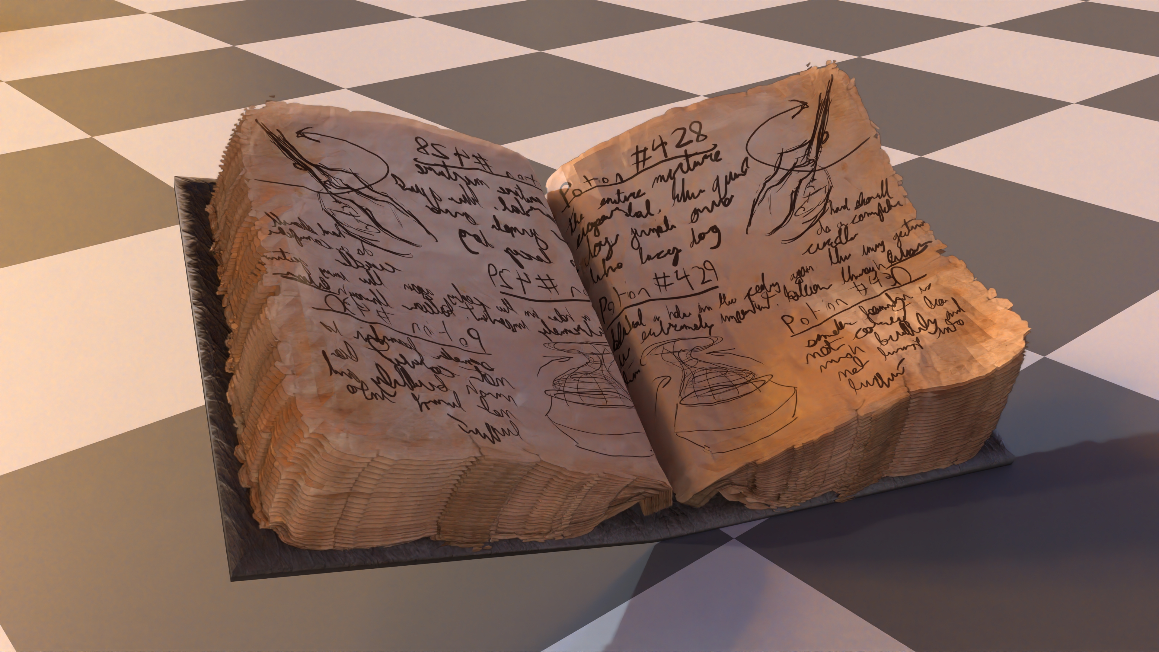
Yes the page teture is mirrored, yes it’s ugly. But the otherside of the journal isn’t visible in a way that this is noticeble from the camera and I’m lazy.
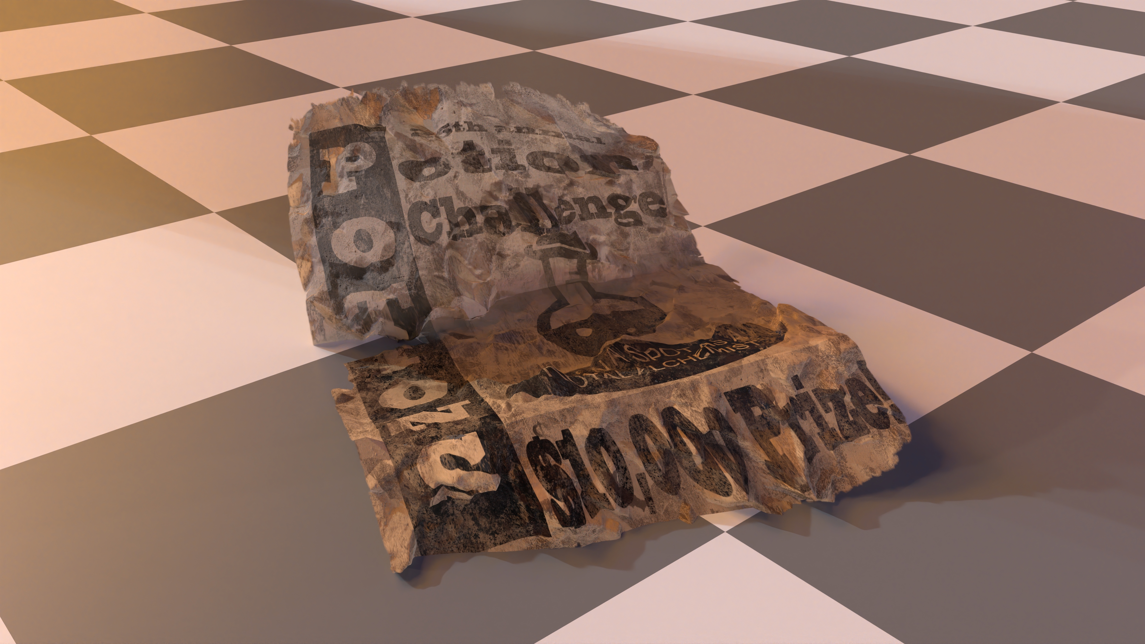
I also used a lot of the material assets from the journal on the potion challenge flyer. However, instead of relying on a cloth sim, I modelled this one because I had a very specific idea of how it needed to be folded in a way that made the text readable from the camera. I exported a procedural “crumples” height map from Substance Painter that I plugged into the displacement to help make it look extra crumpled:
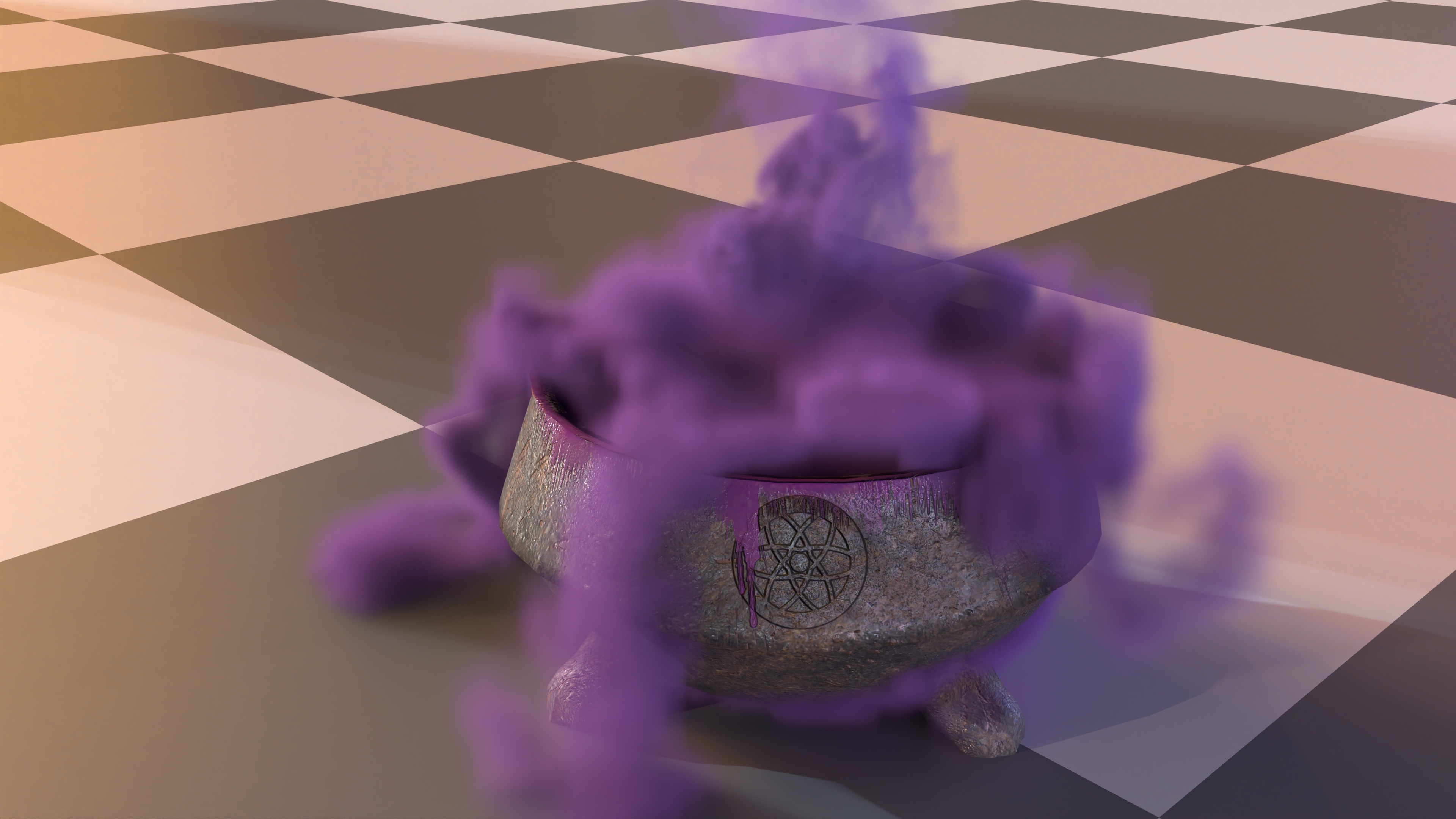
Cauldron
I wanted to have the ol’ classic witch brewing up a potion in a cauldron kind of scene. Texturing the pot was straight-forward but getting the smoke right was harder. I actually ended up generating 2 different smoke volumes that I overlay, both out of Houdini.
The first is just a simple candle flame swirling around. It’s basically just an out-of-the-box candle flame sim from Houdini but it had enough intersting shape and texture I stuck with it:
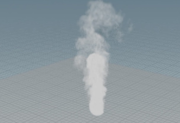
The second volume was much more trickier to get right. I imported the cauldron model into Houdini and added a smoke sim that starts in the shape of a sphere and added some outward velocity so it would billow out of the cauldron. It worked decently but I bumped into a visual issue. With it billowing uniformly out of the cauldron, it started to obscule the cauldron and just looked like a big ball of smoke:
There’s a cauldron in there…somewhere.
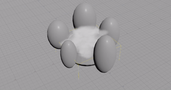
What I wanted instead was little tendrils of smoke so that you’d see thick streams of smoke, but also some holes in the smoke so that you could see the cauldron underneath. I played with the sim a LOT trying to get muck with the velocity forces to do what I want. No matter what, the smoke would diffuse out and I couldn’t get the gaps in the smoke the way I wanted. So I rolled up my sleeves and started to think hacky. My solution that I ended up actually using was adding a whole bunch of sphere blockers to force the smoke down certain gaps and leave other areas empty.
I was pretty happy with the final result using the spheres. Getting these volumes from Houdini and rendered out into RenderMan is pretty straight-forward using RenderMan’s OpenVDB support. Luckily exporting VDBs works even in the free version of Houdini (Houdini Apprentice), sweet! I did little else in the material other than a global multiplier to fudge the density values and a uniform purple albdeo color for the volume.
The cauldron itself is a relatively simple material whipped together in Substance Painter. I started with a base of iron and added a bunch of rust and scratches to make it well used. Around the rim I added some shiny purple liquid stains to look like some of the potion mixture was stirring out. Here’s how that looks in a render:
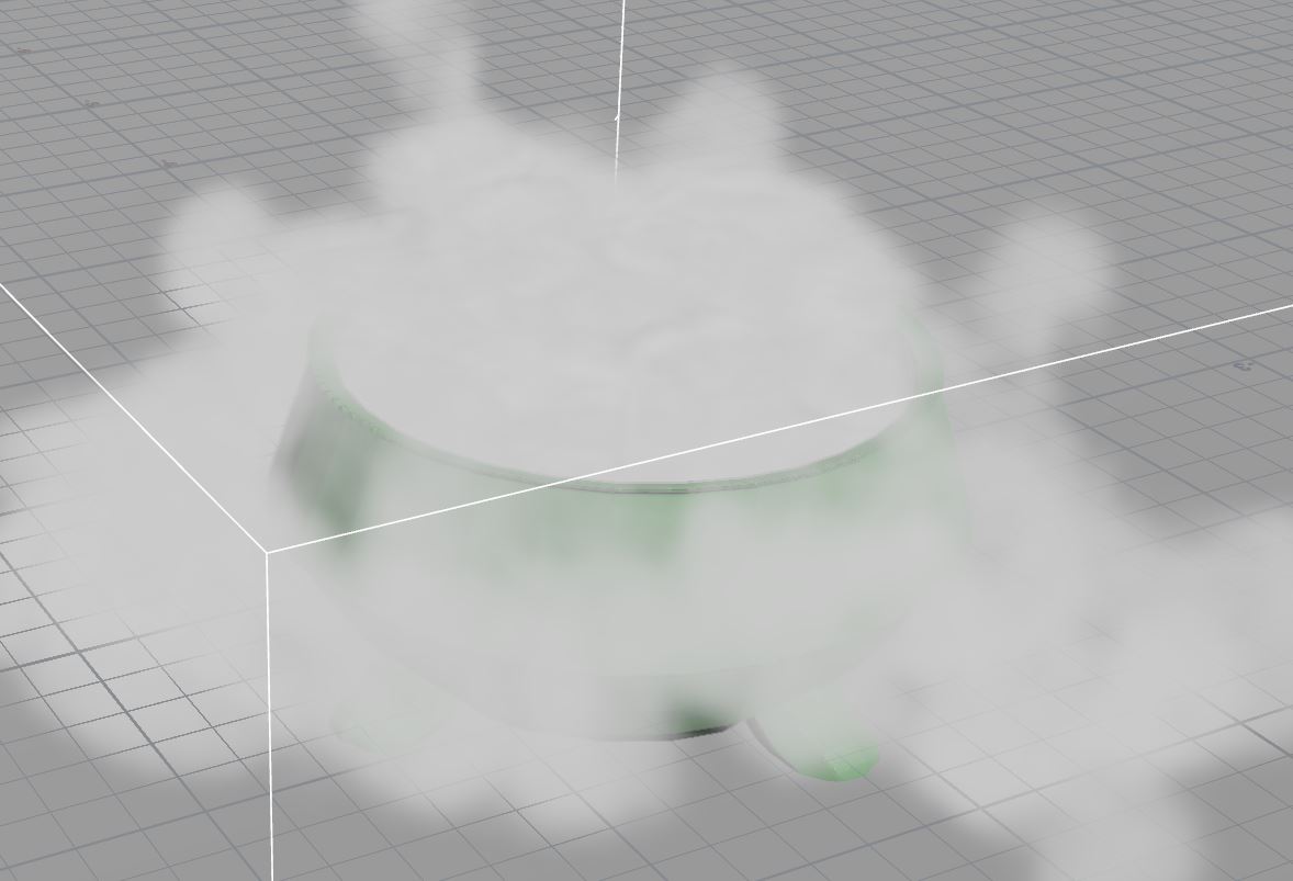
 Volumes are visibly low resolution, never got around to doing it at a higher resolution unfortunately…
Foliage
The foliage isn’t a center piece in the final render but I still added a fair amount to the scene. Going back to the idea of a magical library, I wanted to give a feeling of life to the room as well as a bit of neglect.
SpeedTree generously gave everyone in the competition a 30 day trial to help generate some assets. I didn’t do anything advanced, but I did create several vines using the “trellis growth” template provided and imported some of the important scene geometry so that the vines would wrap convincingly in the scene.
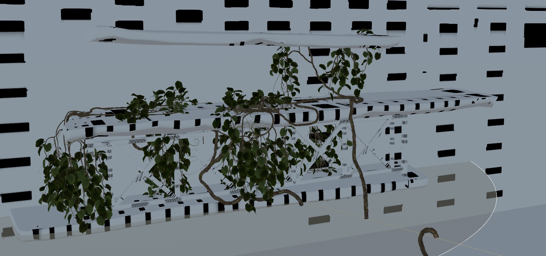 SpeedTree viewport with a modified version of the trellis growth template and the Magic Shop scene geometry
Getting the mesh and material into Maya with RenderMan went without a hitch using SpeedTree’s RenderMan plugin, didn’t need to do any material wiring, it all worked out of the box with the leaf tranmistance done for you, nice!
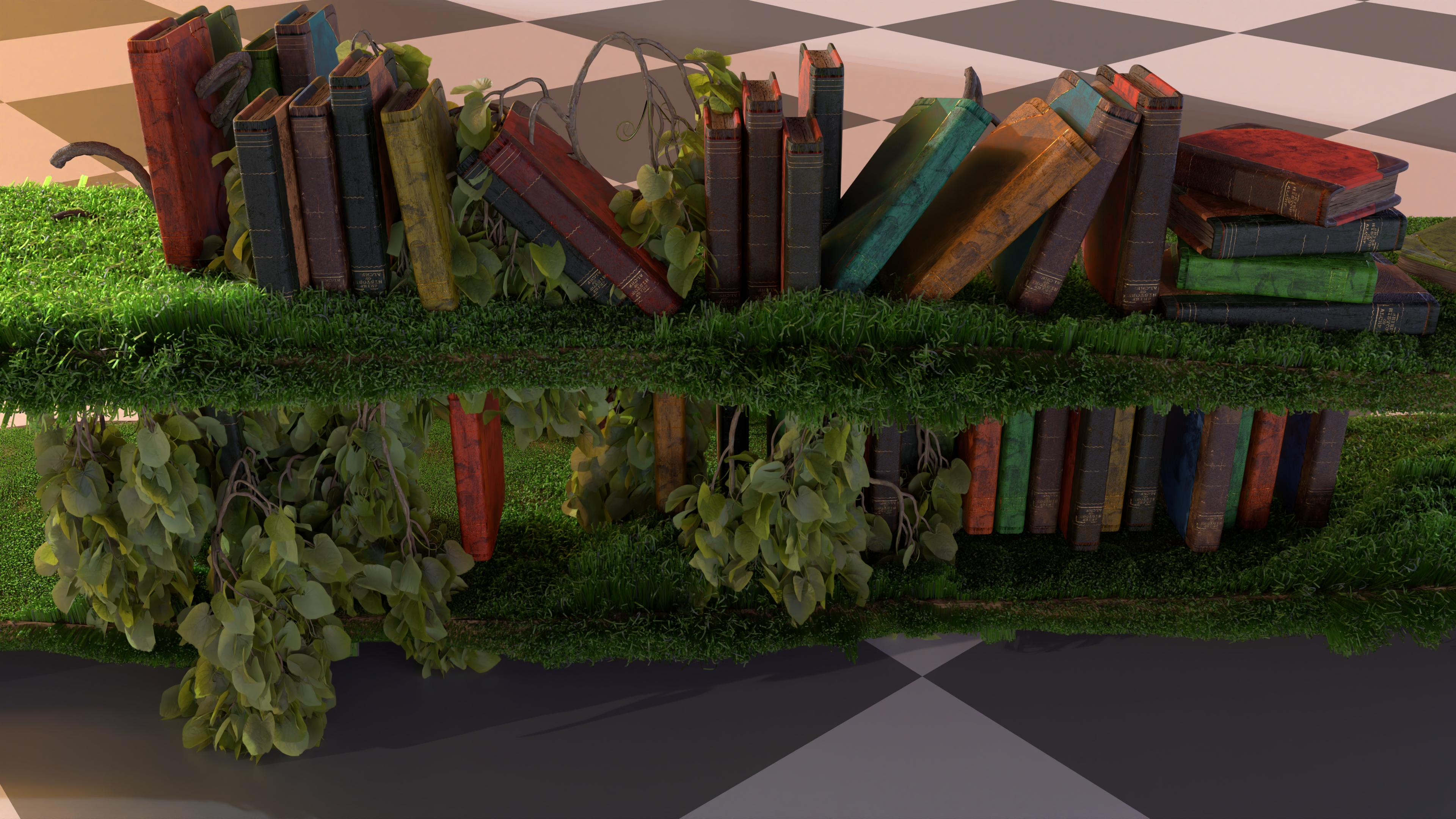
I also liked XGen grooming for the blanket so much that I also decided to use it for adding moss on to the wood shelves. Almost all the moss is blurred out by the depth of field out so I didn’t need to spend too much time on detail, but it’s definitely noticeble and you can tell it’s adding to the shelves silhouette, making it look more compelling than just painting on moss on the shelf as a texture
Combining all of that together, here’s an example of how the book shelves looked:
 Actually this has more XGen “hair” than the one I used in the actual scene, not sure why the hair grew, but you get the idea…
Lighting
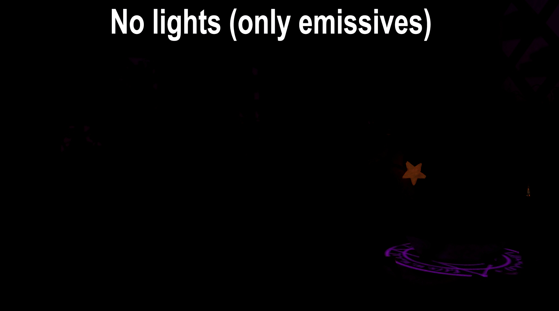
So take a minute to look at the final render again, how many light sources do you think are in this scene?
Most people would probably say five. Four candle lights and one for the moonlight. Six is also reasonable if you consider the emissive spell circle a light source. The real answer?
cue drum roll
13 lights! Actually it’s more if you count the composited fog layers. If you do lighting a lot, this is probably no surprise. But to anyone else, I’d imagine this is a little surprisng! It certainly surprised me! As a real-time rendering engineer and I like to dream of the lofty days when we have true real-time path tracing and all the lighting will just look good. And when I started the challenge, I had the expectation that I’d just put light sources where it makes sense and the GI would just make everything look great out of the box. But the goal here isn’t just to make something looks real, we also need to be thinking about questions like:
- Is there a good balance of both dark and light values?
- Does the lighting support the primary story telling?
- Does the lighting lead the eye to the focal point?
- Does the lighting help distinguish between a foreground, midground, and background?
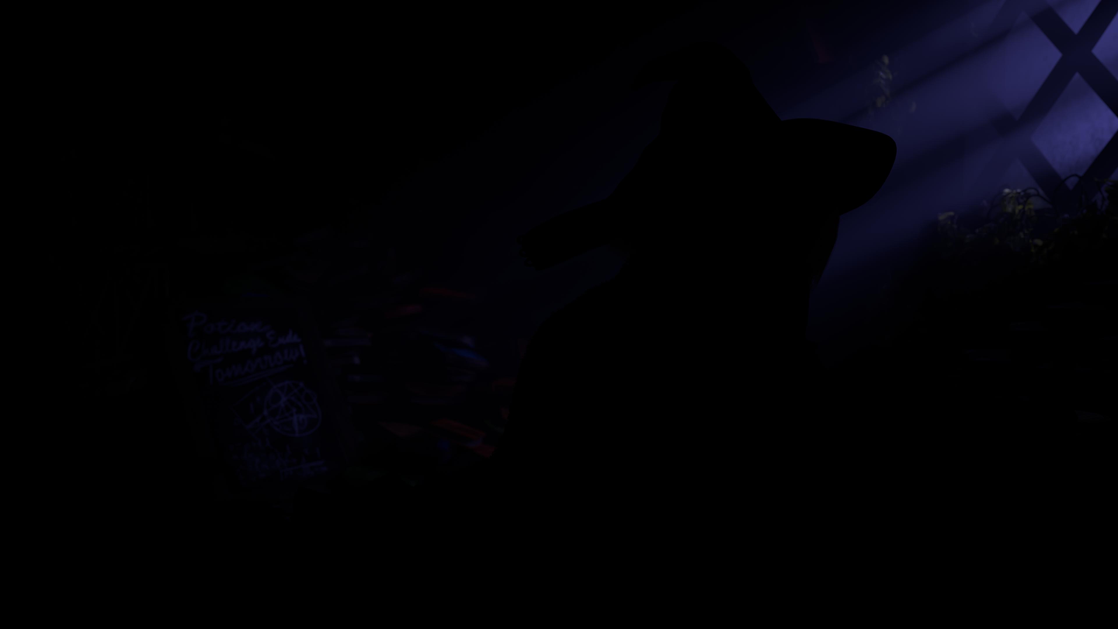
All of the above are questions that can’t be solved via tech, because it’s no longer about physics but artistic intent. It’s actually quite challenging to evaluate these questions, however there’s a few tricks to try and get a sense of it. The first is looking at the image in black and white. This removes color from the equation and allows you to evaluate the image purely in values. Here’s a couple of the things that I continually was checking on:
- The character and desk should be distinctly brighter than the rest of the scene so that it naturally attracts the eye.
- That the darkest darks in the background are close to a true black. Because this is a night scene, it’s important I keep the overall scene dark. I’ll mention this in the next compositing section, but it can be easy to lose this darkness when there’s volumetric scattering in the mix.
- The chalkboard should be brighter than the rest of the background but not brighter than the character. It serves as a secondary story element so it should be notable but not steal focus from the character

One other trick I picked up from Leif Pederson was to look at a blurred version of the black and white image. This is a good way of making sure the overall composition of values still looks good without getting distracted by individual details. This is a little harder to quantify, but the eye should still naturally be drawn to the focus just due to the layout of the values. If the focal point is getting lost because the values get muddled after a blur, it’s a good sign that there’s not enough contrast between different regions of the image
So what about those 13 lights? What are they? I could walk through them all but I figured it’d be easier to just visually show them:
Compositing
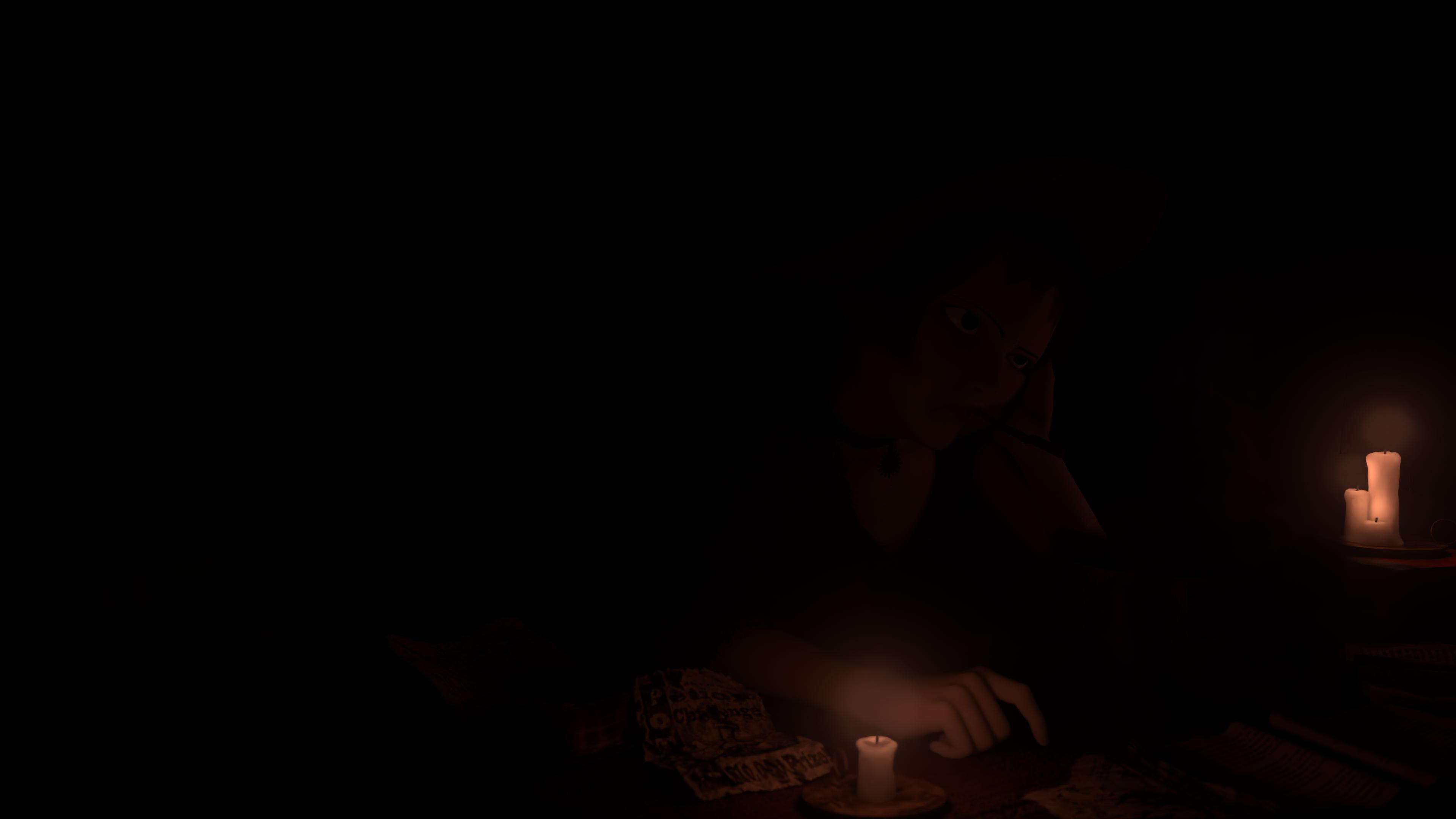
In addition to my primary render, I also rendered out 2 different renders adding light rays from the windows and some extra volumetric lighting around the candles. The reason these need to be rendered out on separate layers is because of some of the settings required to get nice volumetric lighting. In order to get nice light rays, you need to crank up the amount of volumetric density (essentially emulating how “dusty” the room is). However, this also has the side effect of reducing visibility of the background and causing a spread of lighting that can kill your contrast. As a result, it’s nice to restrict these volumes into their own pass so that you can limit their effects to a single light source.
Here’s what the render of the light ray pass looks like:
And here’s what the volumetric lighting pass for candles looks like:
After adding the passes together, I just do a smidge of color correction to get tweak some of the brighness values. I actually spent a lot of time agonizing over some very minor brightness tweaks. The main challenge I found with having a night-time scene is a majority of your scene ends up with darker values and trying to keep details visible while also not overbrightening the scene is really hard. To make matters worse, I found that my image looked drastically different depending on whether I looked at it on my phone, my laptop, or a desktop monitor. It was quite frustrating because it would look far too dark on one screen and far too bright on another. So which screen do you calibrate for?
Ultimately I tried to hit a sweet spot that looked average across all screens, though inevitably it looked better on some screens than others. A trick I used to sanity check was Photoshop’s histogram of luminosity. I grabbed a whole bunch of reference art/photos of night scenes from professional artists who actually know what they’re doing and compared the luminosity histogram to my render just as a way of knowing I was in the right ballpark.
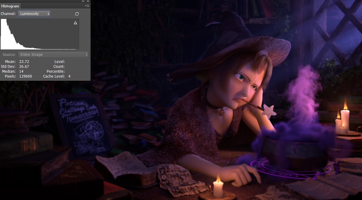 Luminosity histogram in Photoshop
Final Thoughts
You’ve made it to the end, thanks for reading! Ideally this might encourage some of you to give something like this a shot. Here’s my takeaways distilled into several points:
- Lighting is really, really hard. You could have the most realistic renderer in the world but it doesn’t mean lighting automatically looks good. Tons of work needs to be done to really help guide the eye to the focal point of a shot, form an interesting composition, and a billion other things that need to be properly balanced. I think when we see nice rendering, both in games and in movies, the tech gets most of the credit when the reality is that half the magic is coming from talented lighting artists.
- Actually, just doing art is hard. Ignoring the technical difficulties, the whole challenge, my brain just kept going “this looks like garbage” basically on endless repeat. Even coming up to the last day I still had that playing in my head. Certainly I don’t have those kinds of doubts when I’m coding. It’s hard to say if it’s because I have a lack of experience doing art things or if it’s just the nature of working on something artistic where it’s impossible to objectively say something isn’t bad. Though I hear it’s the kind of thing even professional artists struggle and push through, but I’d love to hear an artist’s take on it.
- Using simulations and trying to art direct something can sometimes feel like competing goals. I had multiple times where I started by using simulation to get a certain look and realized doing things manually just a better and faster way to go about it. For me, it was easy to get stuck in a bad loop where I keep tweaking knobs in the simulation hoping it will act one way only for it to react in some other completely different way. Curse you physics! In my opinion, if you have a detailed, concrete idea of how something should look, getting simulation physics to live up to your vision is going to be battle. If you have vague idea or just a looser idea of how things should look, then a simulation might be a better fit. I’m no VFX artist though, smarter people who know their way around Houdini can figure out ways to get wrangle a simulation to work the way they want.
- Using VDBs is fun. Being able to just generate these crazy volumetric things from Houdini and then just drag and drop it into a scene is really cool. I think this is one of the areas where real-time has the most to catch up on. There’s been a lot of exciting advances in volumetric fog in the last couple of years. RDR2’s unified cloud/fog system is very cool and I’m biased, but I also really like how UE4’s volume fog was used in Gears 5. However so far these volumetric fog approaches are more for large blobby volumes like clouds and fogs, I’d love to see these tailored for more smaller scale volumetrics with finer details like the cauldron smoke.
- Splines are really cool and you can get some nice looking materials for not a lot of work. I hadn’t had the opportunity to do much with splines before because until some of the recent advances in strand-based hair (Frostbite’s latest hair talk is very cool if you haven’t seen it), it wasn’t an option in real-time. But I really love how nice things can look just out of the box by spamming a bunch of splines on top of it in combination with RenderMan’s hair material.
Credits
All the renders are of course done in RenderMan. The Mathilda model is by Xiong Lin and rig by Leon Sooi. Pixar models by Eman Abdul-Razzaq, Grace Chang, Ethan Crossno, Siobhán Ensley, Derrick Forkel, Felege Gebru, Damian Kwiatkowski, Jeremy Paton, Leif Pedersen, Kylie Wijsmuller, and Miguel Zozaya © Disney/Pixar - RenderMan “Magic Shop” Art Challenge. For the isolated object renders, the environment map uses an HDRI from HDRI Haven.